
I was in on Mad Men from the ground floor when it came out in 2007.
My wife and I even dressed as Don and Better Draper for Halloween that year.1
I knew this could be a Pantheon-level show after watching the finale for the first season after Don does the carousel pitch to Kodak:
The storytelling is beautiful:
In Greek, nostalgia literally means ‘the pain from an old wound.’ It’s a twinge in your heart, far more powerful than memory alone. This device isn’t a spaceship. It’s a time machine. It goes backward, forward. It takes us to a place where we ache to go again.
It’s not called “The Wheel.” It’s called “The Carousel.” It lets us travel the way a child travels. Around and around and back home again. A place where we know we are loved.
The Mad Men era of the 1960s emerged with more widespread adoption of the television set. In 1950 roughly 9% of American households owned a TV. That number jumped to 65% by 1955. By the early-1960s, the penetration was over 90%.
And the advertising industry was possibly one of the biggest beneficiaries. Radio was a nice way to send a message but the ability to use visuals to sell your product was a game-changer.
David Halberstam describes this shift in his book, The Fifties:
At first the television departments of the major agencies were small, understaffed, and lost money. That changed quickly enough. “We discovered,” said Rosser Reeves, one of the prime architects and beneficiaries of television advertising, “that this was no tame kitten; we had a ferocious man-eating tiger. We could take the same advertising campaign from print or radio and put it on TV, and even when there were very few sets, sales would go through the roof.” The speed with which television’s power ascended awed even those who prophesied it: In 1949, Madison Avenue’s total television billings were $12.3 million; the next year, it jumped to $40.8 million; and the year after that, it jumped to $128 million. Television, of course, could do what radio never could, for it was visual. “Show the product,” said Ben Duffy, one of the men who was writing the rules even as he learned them, “and show it in use.”
In advertising, as in almost all walks of life, best story wins. But how the story is presented can also have an impact.
In his book Alchemy, advertising executive Rory Sutherland tells the story about some A/B testing for charitable giving. They sent out hundreds of thousands of envelopes to potential donors in equal amounts like this:
- One was hand delivered by a volunteer.
- One included a form to receive a 25% tax rebate.
- One was in a better quality envelopes.
- One was in a different format.
So which one had the highest response from donors?
I would have assumed it would be the tax rebate option since inceptives can be so powerful. Nope. The logical option had the lowest response rate. The best response was from the higher quality paper.
Maybe humans are just superficial but there is something to the visual aesthetics of higher quality that can made a story more compelling. Stories tend to stick with people more than statistics.
Stanford researchers had students give one minute presentations filled with both narratives and data. When the audience was later asked to recall different aspects of the pitches, just 5% of people could remember statistics while two-thirds of the crowd recalled a story that was told.
The problem is that in finance the numbers are important. Statistics do matter. Data can help you make better decisions.
I love using data in my communications. It can be extremely useful in terms of setting expectations, creating baselines and providing context. It all comes together when you can combine stories and data visualizations.
That’s the secret sauce.
In Risk & Reward I used more than fifty different charts, graphs, tables and visualizations.2 Here’s me making a hard sell for the visuals in the book on The Compound and Friends last week:
It was really important for me to make the book visually pleasing. Daniel Parra from our production team designed the cover for me. Chart Kid Matt helped with the formatting on the visuals in the book.
Let’s look at two charts from the book to talk about the stories they can tell.
This one shows the average daily gains and losses on the S&P 500:
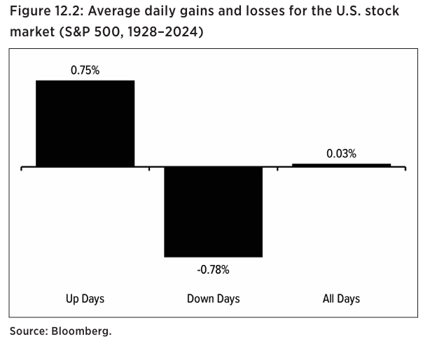
It’s hard to believe the average daily gain over the past 100 years or so was just three basis points. Those handful of basis points really compounded over the long-run. The total price return of the stock market in this time frame was nearly 40,000%. When you add in reinvested dividends, now we’re talking more like one million percent in total!
No one is investing for 100 years but the point is the data shows the longer your time horizon, the better the compounding and the higher your probability for success. This loss rate chart going back to 1950 shows the importance of extending your time horizon to improve your odds of success:
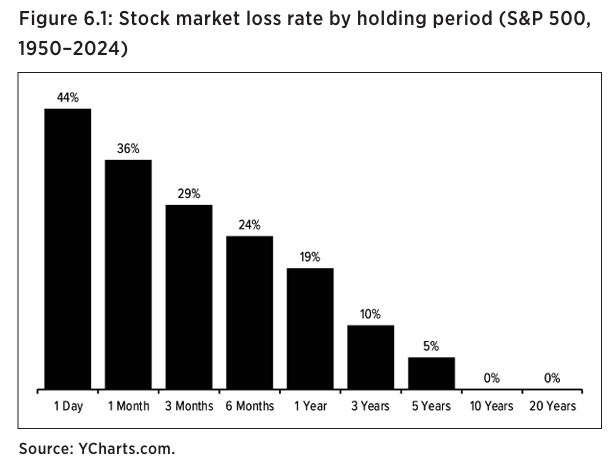
Since 1950, 44% of all trading days have been losses. But 81% of the time the market has been up on a one year basis. 95% of the time the market has been positive over 5 years. Extend your time horizon to 10 and 20 years and it’s been all gains.
Check out all of the charts in the book here.
Further Reading:
Everyone is in Sales
1No one knew who we were supposed to be.
2For the audio book listeners, my publisher has a PDF with all of the charts so you can follow along as well.