
I’m convinced that more economic data is just making us all angrier.
You can now slice and dice the economic number pie in so many different ways that you are bound to make one group of people mad at all times.
Ah well. So goes progress sometimes.
There are two viral charts that have been floating around for the past year or so that have this effect.
The first is from the National Association of Realtors, which shows the median age of homebuyers was 59 years old in 2025:
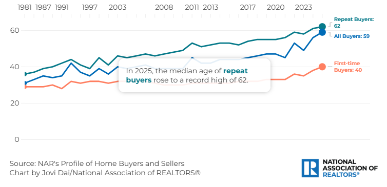
That’s up from the mid-30s back in the early 1980s. This is not a fun trend.
The other one shows that the top 10% now accounts for nearly half of all consumer spending:
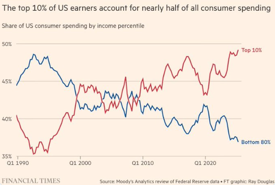
This is the K-shaped economy where the rich get richer and everyone else is left fighting over table scraps in the back alley.
Both of these charts make young people furious because they show all the rich old people are sucking up all the financial oxygen these days.
Charts like this are depressing.
Why should young people get boxed out of the housing market? Why should the top 10% get to spend all of the money? The K-shaped economy is only getting worse!
Here’s the problem with these two viral charts that make a lot of people very angry — they’re not accurate.
The narratives seem realistic. Rich people are spending all the money! Old people are buying all of the houses!
But it’s actually not true.
The NAR data is based on a survey. Sometimes, surveys are wrong. Guess who doesn’t answer surveys anymore. Young people! Who does? Old people!
Connor O’Brien discovered the 59-year-old number was not corroborated by other data sources:
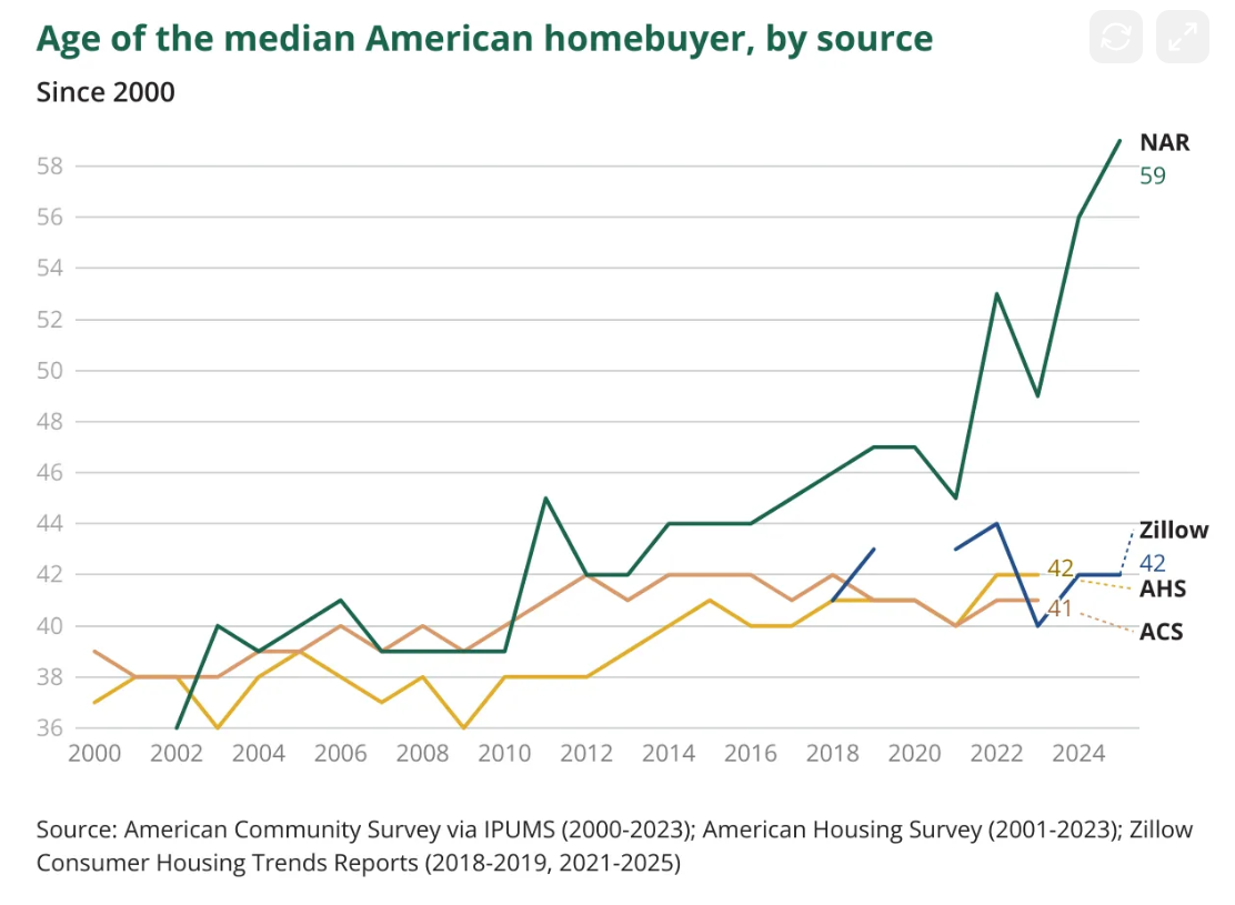
O’Brien explains:
Much larger government-run surveys like the gold-standard American Housing Survey and American Community Survey show no increase whatsoever in the age of the typical homebuyer since the pandemic, when NAR’s median age estimate went truly vertical. My analysis of American Housing Survey data finds the median buyer in 2023 was 42. A similar estimate using 2023 American Community Survey data shows a median age of 41, unchanged for well over a decade.
Surprisingly, the median age of homebuyers hasn’t really changed at all this decade. That’s despite one of the biggest affordability shocks in housing history.
The data also doesn’t match up with the chart that shows the top 10% accounts for 50% of spending.
Ernie Tedeschi came up with a much lower number:
In fact, it’s lower than it was before the pandemic.
Matthew Klein agrees:
According to the joint BEA-BLS estimates, the top 1% of households by disposable income have consistently been responsible for only about 2-3% of total PCE, while the groups immediately below them (95-99th and 90-95th) have each been consistently responsible for about 9% of PCE. In other words, the highest income households generally spend about twice what one would expect from a perfectly egalitarian distribution even though their incomes are about 3.5x the maximally egalitarian outcome. Meanwhile, the bottom 80% of the income distribution has consistently been responsible for about two-thirds of total consumer spending, with the bottom 60% responsible for about 42%. The viral claim that the top 10% of earners are somehow responsible for half of all consumer spending is not remotely consistent with the official data.
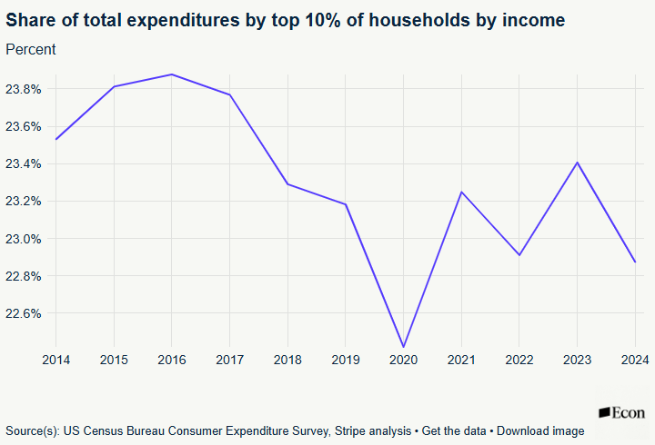
Tedeschi also shows that low-income households are spending more than the viral chart shows:
Multiple spending surveys show low-income household spending performing at least on par with high-income households over 2025. Households making under $50,000 reported spending growth of 5% over 2025, versus 4.6% for households making over $100,000. While inflation-adjusted retail spending for lower-income households grew modestly slower than it did for top-income households in 2023 and 2024, the gap converged through 2025–low- and upper-income consumption grew at similar rates. This is consistent with lagged but larger and more-reliable government data, which shows the top income decile’s share of aggregate spending at 22.8% in 2024, down from 23.4% in 2023 and below the recent peak of 23.9% in 2016 (economist Antoine Levy has a helpful deep dive on the data here).
This data doesn’t fit the narrative does it?
I’ll be honest — I got got by both of these viral charts too. It would make sense that only older people can afford houses. It would also make sense that rich people are basically carrying the economy.
Of course, housing affordability is still a problem. Income inequality is real.
Is it much more expensive for young people to buy a house today? Absolutely.
Is the top 10% much wealthier than the bottom 90%? Yes.
The top 10% controls nearly 70% of the wealth in this country.
But it’s not as bad as you think right now.
Don’t let the economic data make you mad.
Further Reading:
Rich Old People